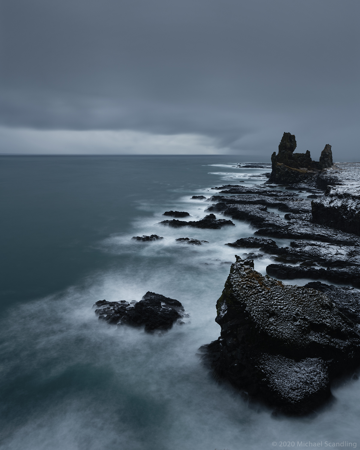
January 24, 2020 — Londrangar View Point, Snaefellsjökull Peninsula, Iceland
Taken a few minutes earlier than the one in the post before last, this shows the unaltered colors that the camera recorded. I had previously thought the color was a distortion of reality and blamed it on a brand of filter I’d never used before, but no — the water really is that color.*
The next post will move us forward.
(Nikon D850, Tamron SP 24–70mm f/2.8 Di VC USD G2. ISO 64, 30 sec at f/16; 6-stop neutral density filter. RAW processing in DxO PhotoLab 3.1; Editing in Adobe Photoshop.)
* At least it’s as close as WordPress will allow, because the color I see here is a bit more muted than what I see in DxO and Photoshop. Sigh.

Fine shot, Michael!
LikeLiked by 1 person
Thanks very much!
LikeLike
Yes, I understand your slight dismay about the discrepancy in tone on various platforms…it drives me round the bend! Lovely photo though, nevertheless…oh to be in Iceland!
LikeLiked by 1 person
Thanks very much. You should go!
LikeLiked by 1 person
Very striking nonetheless, Michael – perhaps, as you say, the sea’s colour has to do with the high latitude and the angle of the sun’s rays in the atmosphere; very impressive. A 🙂
LikeLiked by 1 person
Thank you. I still need to research that.
LikeLiked by 1 person
What I noticed was not the change in color but the change in orientation, from horizontal to vertical.
The texture of the rock at the lower right reminds me of charred wood.
LikeLiked by 2 people
The horizontal shot was specifically for the blog. I think it works better in this vertical orientation. The rock is volcanic basalt, so it’s charred alright!
LikeLike
Great post 🙂
LikeLiked by 1 person
Thanks!
LikeLike
Unbelievable!!!
LikeLiked by 1 person
Very cool! Reminds me of images of what (they imagine) the earth looked like, when it was a young planet, and before there was life here.
LikeLiked by 1 person
What an amazing image!
LikeLiked by 1 person
Thank you kindly!
LikeLike
Love it
LikeLiked by 1 person
Thanks!
LikeLike
Great shot, Michael. The color is gorgeous!
LikeLike
Thank you very much. I would’ve said, and did say at first, but the color was unbelievable!
LikeLike
Well done Michael. I’m not sure I could stand the cold it takes to take such a great shot… 🙂
LikeLiked by 1 person
Thank you very much. The temperature by itself wasn’t so bad; it was the wind chill factor in the fact that the wind carried some very cold, very wet snow.
LikeLiked by 1 person
In northern countries, the wind can be “deadly”. I lived in Holland as a child for a few years. Per se, Holland is not that cold, but the wind, oh the wind! 🙂
LikeLiked by 1 person
💨🌬 Brrrrrr…
LikeLiked by 1 person
Holland, like Belgium is a flat land. Not much to stop the wind. 😉
LikeLike
This is a gorgeous and unusual shot! The icy blues and the black rocks forms cutting through….my eye unconsciously searches for “red” or even brown…and there is a slight hint of that ……
LikeLiked by 1 person
Thank you very much. It really struck me how monochromatic it is. But yes, there are little tiny touches of red and brown.
LikeLike
I just mentioned being out of it to Melissa and here I can say so again as I read “Loneranger”. I’ve often complained about WordPress’ lack of color management and used to try several versions before posting. I finally gave up as you never know if someone is looking with a calibrated screen anyway.
I like this color and it says stormy to me. Love the long exposure’s effect on the surf.
LikeLike
Whatever is going on with the colors, it’s beautiful. And since we’re looking at water and light, I’m sure the color changes constantly.
LikeLiked by 1 person
Interestingly since it was a 20 second exposure, that is definitely the color of the water under cloudy skies. I’ve been looking at a lot of photographs of Iceland, northern Norway northern Canada and northern Alaska and the color shades are similar to this in those photographs. it’s like blue hour is REALLY blue in northern latitudes in the winter.
LikeLiked by 1 person
Otherworldly and breathtaking shot! How fortunate to be able to capture such extraordinary places!
LikeLiked by 1 person
Thank you very much. It is a truly remarkable place. The shot is all the more interesting to me because there were 50 km/h wind gusts at our back and it was snowing quite heavily.
LikeLiked by 1 person
That means not just a great photographer, but also a very persistent and resilient one! 🙂 I can just picture that!
LikeLiked by 1 person
Thank you. Brrrrrr!
LikeLiked by 1 person
‘Brrrr’ indeed!!!!!!!!
LikeLike
Since you’re an artist I’d be curious about what you think of my formal website:
http://www.amagaphoto.com
LikeLiked by 1 person
Ha… beat you to it! I’ve already had my first journey and admired your floral abstracts… correction, fell in love with them! 🙂
Wonderful site. Simple [which is always a good thing to me] and focusing beautifully on your exceptional images!
LikeLiked by 1 person
Thank you. I like things simple.
LikeLiked by 1 person
Oh, me too! 🙂
LikeLike
It’s the best way.
LikeLiked by 1 person
Yes, it is!!! 🙂
LikeLiked by 1 person