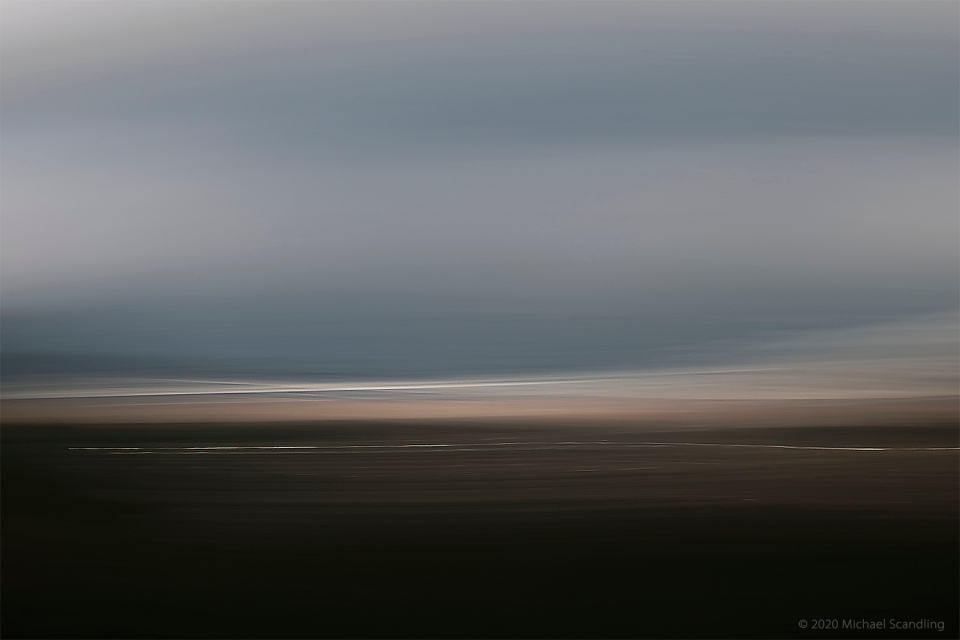
June 26, 2020 —From the Side of Mt.Tamalpais, Above Stinson Beach, California
ICM impression of a fog bank coming in on the beach.
I was thinking, after the past few days a little more color might be nice. Just a little.
(Nikon D850, Nikon 24-120mm f/4G VR. RAW processing in DxO PhotoLab 3.3; Editing in Adobe Photoshop.)

The AuthorMichael Scandling
California based fine-art photographer featuring abstract, impressionist, and minimalist seascapes — near and distant — and floral-based images.
Fine-art photography can be seen at www.amagaphoto.com
All original images on this blog are copyright 2018, 2019, 2020, 2021 Michael Scandling. All rights reserved. No images on this site may be copied, duplicated, reused, published, or re-purposed in any way without express permission from the copyright owner, Michael Scandling.


It’s good that your photo of a fog bank can still rouse such high interest in viewers, given the very low interest banks now offer. Would that banks, rapidly, went back to giving savers a little more interest. Just a little.
LikeLiked by 1 person
Interesting.
LikeLike
The blue/brown contrast is interesting. The white horizontal lines stir the imagine. Thank you for sharing your work. Be safe. Be well.
LikeLiked by 1 person
Thank you. That’s what struck me. This is an extremely small crop of a much larger frame.
LikeLike
Adept expression of both palette and tonality
LikeLiked by 1 person
Thank you very much.
LikeLiked by 1 person
A little color is nice. I appreciate black and white images, and I understand why so many photographers prefer working in b&w at least part of the time, but my response to them is seems intellectual rather than emotional, if that makes any sense. On the other end of the spectrum, I’m not at all fond of overly saturated color, or color for color’s sake, but there’s a large sweet spot, roughly between this image and your abstractions of the California poppies, where I’m really happy.
LikeLiked by 1 person
I understand. The images of the last few days actually are color images but the color is toned way down. This particular one is desaturated quite a bit as well. Watch for the image that I put up tonight which might hit your sweet spot. The poppies really are intended to be explosions of color, because that’s what they are in nature.
LikeLiked by 1 person
Good image – its the colour of the beach here that brings this alive for me. 🙂
LikeLiked by 1 person
Thank you. That’s what jumped out at me too. And the white streak of the surfline. This was taken from a mountain ridge at an altitude of about 1000 feet looking down.
LikeLiked by 1 person
This is seriously opting as one of my favorite of your creations. Such an amazing… oil painting! 😉
LikeLiked by 1 person
Thank you very much. It was actually inspired by an oil painting by a street artist in Munich way back in 1967.
LikeLiked by 1 person
🙂 It’s beautiful, my friend.
LikeLiked by 1 person
🙏
LikeLiked by 1 person
That’s a nice amount of color and all the bands and layers are pleasing. I especially like the warm tones spreading softly toward us and the even more subtle hint in the sky.
LikeLiked by 1 person
Thank you. That’s what my eyes locked onto when I was going through these frames one more time. This is probably only about 1/10 of the entire frame.
LikeLiked by 1 person
Well, 1/10 seems just enough. Sometimes the whole frame is too much.
LikeLiked by 1 person
True. In contrast, today’s is the entire frame.
LikeLiked by 1 person
Interesting! (I’m sorry I’m so far behind – it’s chronic!)
LikeLiked by 1 person
Thank you very much. No worries. I am also behind.
LikeLiked by 1 person