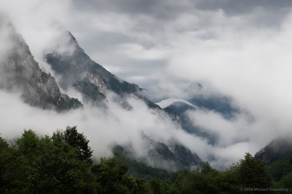
August 12, 2019; Northwest of Locarno, Switzerland — September 6, 2019; Silicon Valley. It was a turbulent night. I awoke at 4:00 a.m. and stared at the ceiling, thinking, “it’s too dark.” But it wasn’t the ceiling I was thinking of. It was the image I’d just posted on the blog afew hours earlier. And there were other things too: Was the foreground too severe? Does it focus the viewer’s attention enough? The tones, tones, tones…
I fell asleep.
In the morning some comments came in. I thought some more.
And then after dinner I dove back in.
Same picture, new look.
(Nikon D850, Tamron SP 24–70mm f/2.8 Di VC USD G2. RAW processing in DxO PhotoLab 2.3; Editing in Adobe Photoshop.)

You got it!
LikeLiked by 1 person
Thank you, sir!
LikeLike
Interesting to see the two versions. For this version, was the starting point where you left off on the first? I’ve assumed so.. I don’t imagine you started from the original again but thought I’d ask anyway.
LikeLiked by 1 person
Do you have an estimate of the greatest number of looks you’ve ever gotten out of a single photograph?
LikeLike
my favourite time right after dark…looks so fresh and beautifully done Michael…☺️ smiles hedy
LikeLiked by 1 person
😊🙏
LikeLiked by 1 person
Liked it both ways Michael!
LikeLiked by 1 person
I could argue for each version and – don’t hate me – I can’t help wondering about something in between. 🙂 The lightness towards the edges in this one allows my eyes to drift away, which isn’t good, though the overall lightness allows more interesting things to happen in the rocks and clouds. It’s always interesting to see different versions of an image, so thank you for that, Michael.
LikeLiked by 1 person
Thank you. There are, and have been, many stage I between. This is one of them.
LikeLiked by 1 person
I like this version better as the lighter tones tell more of the story without detracting from the dark moodiness of the photo. Great shot, must have been an amazing trip!
LikeLiked by 1 person
Thank you. It was. More to come…
LikeLiked by 1 person
I had no complaint the first time and even less than no this time. 🙂 Often tweaks occur to us after the fact. A. Adams went through a lot of chemistry doing that. We just burn pixels. 🙂
LikeLiked by 1 person
It’s true he did. Just look at all the different versions of Moonrise over Hernandez NM, for example. Google the original contact print if you really want to get your mind blown. At least we don’t have to breathe all those chemical fumes.
LikeLike
Yes, I have seen the original. He often said that anyone who stood next to him while he was exposing his film would not recognize the final print. Maybe a bit of an exaggeration on his part but well described. Many of the folks who say the best pictures are made entirely in camera generally do not realize their artistic potential. Although my images are for the most part realistic, I still try to impart my own vision upon them as I know you do also.
LikeLiked by 1 person
Compare the contact print to his later versions and it’s obvious that he would’ve loved Photoshop. My own photos very often stay quite realistic but a significant number of them use the original exposure just as a starting point. Look at my formal website and you’ll see.
LikeLiked by 1 person
Oh this is grand! I do like this one better 🙂
LikeLiked by 1 person
Me too. Thanks.
LikeLiked by 1 person