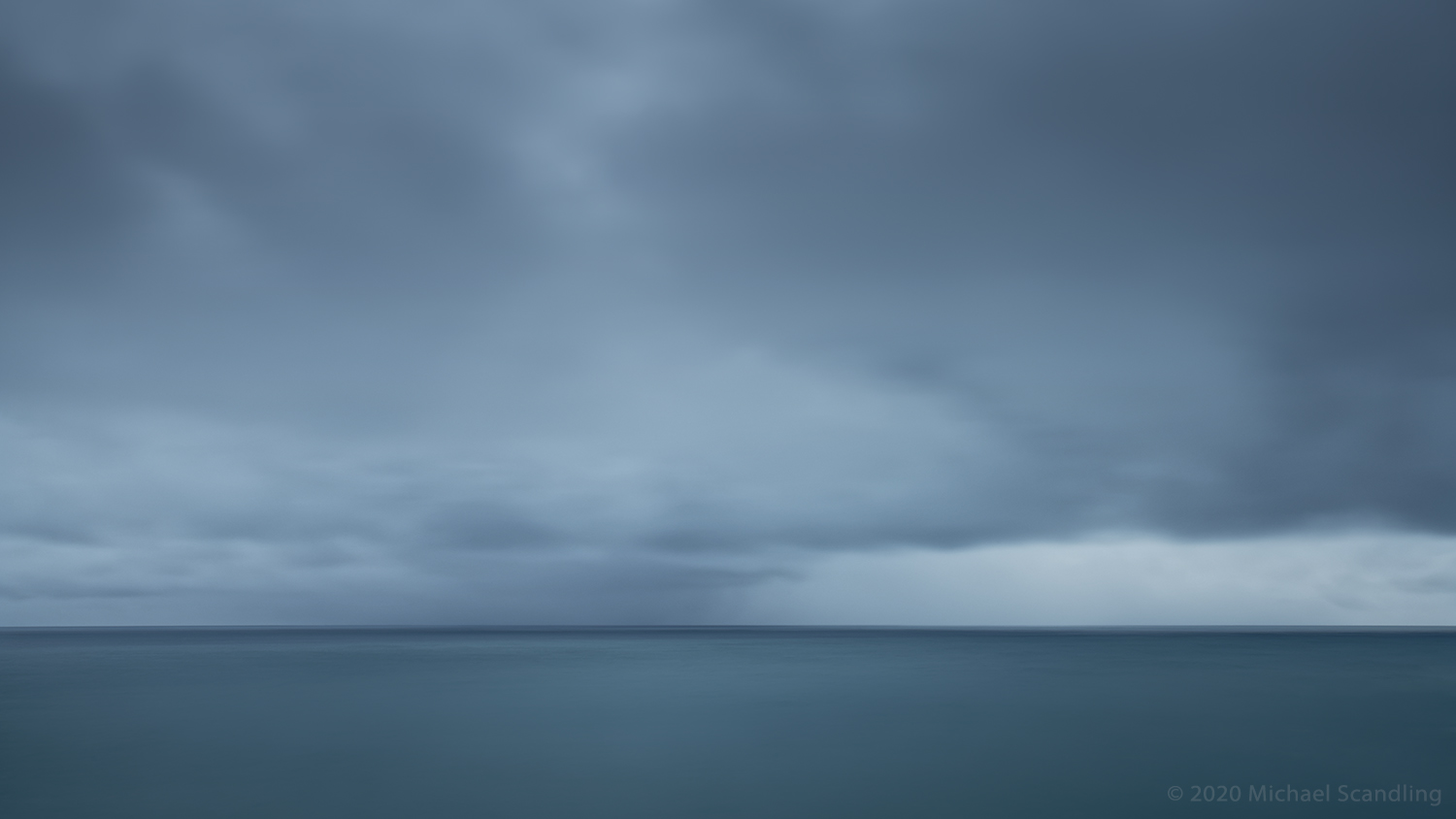
January 24, 2020 — Londrangar View Point, Snaefellsjökull Peninsula, Iceland
I think I’ve only done this once before: posted that same frame twice in a row, with the second being a re-do. There’s a story.
When I posted this picture the other night, I decided at the last minute that the image was too dark. It was late and I was in a hurry, so I simply went back to the 16-bit Photoshop file and adjusted the Levels slider to lighten it up a bit and made a re-sized new 8-bit jpg for the blog. Not really the right tool for the job because the Levels slider alters the tonal balance, but it was too late at night and I was too tired to do it the right way. So I posted it. Close enough, I said to myself. I continued to think about it as I stumbled off to sleep. “No, not close enough,” I thought as I finally closed my eyes.
Despite my private misgivings, the picture got very nice feedback — for which I am grateful — but it just wasn’t what I wanted. Also, WordPress has a way with subtle colors that borders on outright assault and my quick-and-dirty adjustment gave it the the opportunity to have its evil ways* with it.**
Yesterday I took a close look and discovered other color distortions in my Photoshop master file, introduced by my own overenthusiastic use of vibrancy on the sky. Unacceptable.
So I did what I should’ve done in the first place: took it all the way back to the RAW file, made a virtual copy in DxO and had another bash at it. This time I brightened it the right way by raising the Exposure slider, which preserved the tonal balance while making the image brighter. (I confirmed the brightening later when I exported the developed RAW file to Photoshop and made the background white to simulate paper to see what it looked like there.) While I was still in DxO I brought the vibrancy in the sky back down to get rid of the color distortions that I’d inadvertently caused in the first version in a misguided attempt to make the sky richer, and made a couple of local contrast tweaks.
I let it go overnight to let it breathe and took another look in the morning. A couple of localized contrast adjustments — tiny — brought out the barely discernable reflections in the water and at the same time improved the tonal balance between water and sky. Looked at it one last time against dark gray, light gray, black, and white backgrounds in Photoshop to again be sure it was light enough but not too light, cropped it, and it was a wrap.
Now I can sleep.
Thank you for your indulgence.
Be well. Do good. Create.
(Nikon D850, Tamron SP 24–70mm f/2.8 Di VC USD G2. ISO 64, 20 sec at f/16; 6-stop neutral density filter. RAW processing in DxO PhotoLab 3.2; Further editing in Adobe Photoshop.)
For more Seascape Horizons, see amagaphoto.com
*You’ve got to change your evil ways, WordPress
Your blues are warm and your pinks are cold.
You’re messin’ ’round, WordPress
With middle grays and-a who knows what
I’m tired of tweaking and fooling around
I’ll post a photo that’s already dumbed down
This can’t go on…
Lord knows you got to change.
**No guarantee it won’t do it again with this new version but making the adjustments the right way should help. Fingers crossed.
PS. This is my 200th post.

Both images in a gallery allow the viewer to flip back and forth for easier comparison. Just a thought.
LikeLiked by 1 person
Good thought. I’ll have to learn how to do that.
LikeLike
Happy 200.
I’m sorry to hear the first version and WordPress’s mangling of it caused you those misgivings. You must be relieved to have gotten the image more to your liking the second time. Still another factor, also beyond your control, is the monitor on which a person looks at the photograph.
LikeLiked by 1 person
Thank you very much. Yes, the viewer’s monitor is a complete crapshoot. And a lot of monitors really are crappy. I keep mine pristinely calibrated so at least I’m putting out a good product. Back in my recording studio days, we would never finish a mix without listening to it on normal run-of-the-mill home speakers and car speakers. The mix had the sound at least acceptable on those as well as the studio monitors. I very often double check on my iPad, although iPads are actually quite color-accurate.
LikeLike
Good thing you finished this before bed. Otherwise you’d have tossed…maybe. I sometimes get up in the middle of the night and delete a post realizing I bungled it. That said, the things that bothered you are not that noticeable to the rest of us which is typical of an artist.
I used to redo my images based on the way WP displayed them. I finally decided that I wasn’t going to stress about it if I knew that it was correct on my calibrated monitor.
LikeLiked by 1 person
Maybe. I have in the past on an image I’m particularly infatuated with. It’s true that most of what was grabbing my attention might not be visible to others, especially on an uncalibrated screen, but what really put me over the edge was the self-induced color distortions in the sky, which are not easily visible on the blog but screamed out at me — and my muse — as we looked at the image the next day. This image may end up being a portfolio piece, so I had to fix it.
LikeLiked by 1 person
I find that I have a difficult time keeping the recommendation in mind – walk away for a period of time after 20-30 minutes and when it’s done…walk away for a number of days…weeks, maybe – as we become blind to the “mistakes.”
I like the dark edge along the horizon which meets the lighter tone. There is also an invitation to visit the horizon from the top of the image. Beautiful shades of blue.
LikeLiked by 1 person
Thank you very much. I’ve been following Bruce Percy’s recommendations regarding letting it go for hours, days, weeks and they work. One can get so interiorized into an image that one loses objectivity and it all turns to mush. And it’s a really good idea not to work when you’re tired!
The dark edge is what initially attracted me; that and the color and luminosity of the water compared to the gray sky. In the original version, tonal balance between water and sky were out of kilter. Out of balance. You can have a juxtaposition that harmonizes or you can have one that fights against itself. To me, it harmonizes in the second version and fights in the first.
Philosophically and aesthetically, the reason I’m drawn to ocean horizons is the calming effect of putting one’s attention on something that is stable and distant. I use various techniques in post-processing to pull the viewer’s attention into the picture and toward the horizon line and ultimately focus on the horizon line itself and only slightly above and below it. See if you can spot what those techniques might be…
LikeLiked by 1 person
A challenge! It is my understanding that horizontal lines within a photo are calming. I revisited this image and noted that in addition to the dark line in the horizon — which my eyes first moved toward — the light on the right side above the horizon invites my eyes to stay and rest for a bit. I also see vertical lines via lightening both in the foreground and background. Both begin on the left side of the image and bring me towards the inviting calm light above the horizon on the right. Are there more? Please let me know as I think that Bruce Percey’s writings have opened a door of awareness of image engagement.
I have noticed that often times your images have energy in the foreground through structure and texture and/or in the background through cloud formation and variations of light and shadow.
LikeLike
Ah… I see what you mean, however it doesn’t change my admiration for… both! hmmm 😉
LikeLiked by 1 person
Well, they both have things going for them. Read the other comments on this post to see some more technical, philosophical, and aesthetic thoughts about this image compared to the previous version.
LikeLiked by 1 person
I get it, however, I prefer to use my brain’s vocabulary [which is often non verbal ;-)]. Keeps me more ‘objective’ 😉
LikeLiked by 1 person
😊
LikeLiked by 1 person
I like this image so much more than the last one, which left me wanting something more. The story is interesting, the lyrics are fun (an art therapist would appreciate that you made music/poetry from your frustration). Sometimes I think of people’s monitors as another extension of their subjectivity, i.e. you can’t control either one at all, all are different, but you still do what you can on your end. WP ion the other hand, well maybe someone can infiltrate…
You’re having a good time, Michael, right? 😉 I’m glad. 🙂
LikeLiked by 1 person
Thank you very much. This version is considerably more pleasing to me. Mainly it’s the better tonal balance.
I’m having a very good time, as a matter of fact. I find that if I take a humorous approach such things as my displeasure with the way WordPress interferes with subtle colors, it’s a lot less stressful. I don’t necessarily, nor completely, agree with the idea that you can’t control either one at all. Sometimes it’s difficult to control the other end. Indeed, it may be practically impossible in some cases — but it’s true that you can always control your own end, even if it’s simply controlling your attitude. That said, I should put my money where my mouth is and contact WP tech-support and see if there is something they can do on their end. Or, heaven forfend, maybe I’m doing something wrong on my end.
And are you having a good time? You live in a natural wonderland, and I’m sure it’s still possible for you to get out in it. I so much enjoy your walks in the woods.
LikeLiked by 1 person
Thank you! Yes, it just happens that for the amount of land on this island there’s a lot of public, forested space and shoreline. The state parks are all closed – like CA, right? But local parks didn’t close. Most people are respectful and careful and it’s not overrun with folks from other places. I get onto a trail almost every day. Spring is really exciting, especially because April here is new to me – last year we were away in April, the year before that we lived closer to Seattle. I’m obsessed! 🙂 I think you’ll like the next post – not a walk but a series of images of one species of wildflower. It’s a simple white lily, very photogenic. You’d have a great time with it. Take care!
LikeLiked by 1 person
Super! Looking forward to it. Yes, state parks are closed, but there is still lots to do if you be aware of your surroundings and do things responsibly.
LikeLiked by 1 person