April 15, 2015 — Windy Hill, Woodside, California
I was going to post something else today, but a look at an Instagram post by Óli Haukur inspired me to show this instead.
Oli made the point that most photography instructors stress low ISO settings for low noise and therefore “best” image quality. Image quality these days seems to be based solely on low noise and extreme sharpness. His opinion is that, based on these criteria, many images come out so clean as to look computer-generated. The words I use are “plastic” and “clinical.”
I think that’s fine if that’s what you really want. I don’t usually want it. Usually when I’m working on images, I’m careful not to use too much noise reduction for that exact reason. I intentionally leave a bit of noise in the picture and I often selectively soften parts of my pictures.
In light of that, it doesn’t seem so ironic that as a photographer, many of my influences are painters. Mark Rothko is one, as many of you know. But Georges Seurat is another. He is considered to be the father of pointillism — the use of small dots of pure color to create a picture.
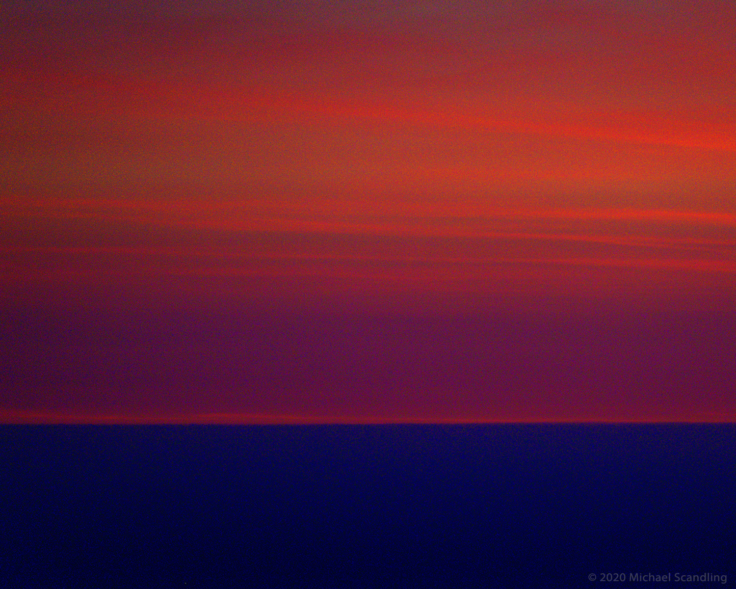
This view of the distant ocean horizon was shot long after sunset, hand-held. The ISO was 5000. It looked pretty blah right out of the camera, but in the contrast between ocean and sky I saw a potential for something more abstract and Impressionist. To that end, I cranked up the vibrance and saturation to make the colors bolder than bold and turned the noise reduction off completely. Then to really bring it home I used “too much” unsharp mask the increase the noise.
And there you go. An homage to two painters at once. It wouldn’t have worked without the noise. Ask Georges.
(Nikon D750; Nikon 28-300mm f/3.5-5.6G ED VR Zoom. RAW processing in DxO PhotoLab 3.2. Final editing in Adobe Photoshop.)

Amazing colours.
LikeLiked by 1 person
Thank you very much!
LikeLike
Oh, I see both Seurat and Rothko… excellent, my friend! I was thinking of you today – being Turner birthday! 😉
LikeLiked by 2 people
Thank you very much! It’s Turner’s birthday – totally missed it. But glad to know. I have to do something tomorrow.
LikeLiked by 1 person
I can’t wait!!!! 🙂
LikeLiked by 1 person
Neither can I. There’s a story to tell.
LikeLiked by 1 person
I’m all ears and eyes!!!! 😉
LikeLiked by 1 person
OK. It’ll be my next post.
LikeLike
👍👍👍
LikeLiked by 1 person
It’s valuable to understand our influences and I appreciate knowing yours. This is both soft and bold and quite pleasing.
Now, let’s see if this shows up as a comment. I see that there are five other comments yet none are visible.
LikeLiked by 1 person
This shows up as a comment, and a very good comment at that. Thank you.
LikeLiked by 1 person
You mean Seurothko?
You went against the grain by not going against the grain.
LikeLiked by 2 people
As so often do
LikeLike
🙂 I know what you mean… https://harrienijland.wordpress.com/2014/02/15/blow-up-prt1/ and I totally agree on ‘plastic’ and ‘clinical’
LikeLike
Very interesting link, food for thought.
Cheers.
LikeLiked by 1 person
This is the difference between a photograph and a picture. A camera can produce a photograph; an artist a picture. I’m not trying to blow my own horn with this. I’m simply trying to point out a possibility.
LikeLike
Ex-freakin’-xactly!
LikeLike
Sometimes I feel the whole industry is geared towards total image perfection. Initially those photos make you go, wow / look at the depth / you can see everything . But after a while I get bored looking at them, as you say it looks clinical.
Regards
AK
LikeLiked by 1 person
That’s exactly what I think. once you’ve looked past the surface, here’s nothing left to see.
LikeLike
so while I been inspired by your “texture and tone” image…today, I’m dancing through colors as I move from one bit of noise (music) to another 🙂 Thank you for the introduction to Óli Haukur.
LikeLiked by 1 person
Thank you, Brenda. Óli is a great guy and a really good photographer. Check out his videos on his website. His advice is very practical and his language is “colorful.”
LikeLike
Excellent post, Michael, and image; very interesting. And I think that “Image quality these days seems to be based solely on low noise and extreme sharpness.” says it all. I subscribe to Amateur Photographer magazine, and the great majority of readers’ (and others’) photos presented there are taken at 100-200 ISO, which to me betrays a great lack of imagination.
And Rothko certainly >>> but its wonderful that you should also mention Georges Seurat >>> “Sunday Afternoon on the island of La Grande Jatte, 1884” has long been a huge favourite of mine – and an inspiration too. 🙂
LikeLiked by 1 person
Thank you very much. It’s amazing how little I worry about my ISO setting. My cameras are often set to Auto ISO as a matter of fact. For most of my Horisont images and most of my floral images I do want low noise and try to shoot at ISO 64 or 100 depending upon which camera body I’m using. For wildlife, it’s almost always on Auto. For performance photography always Auto. My only prime lens is my Nikon 105 mm f/2.8 macro. Everything else is zoom, so there’s a compromise and image quality right there. But, they buy me versatility and my first motto is, “get the shot.“ I grew up shooting Kodak tri-X. Really grainy. I loved it. Most of the photographers who influenced me were, along with the classic photographers of the first half of the 20th century that everybody admires, some lesserknown photographers of the 50s, 60s, and 70s. A lot of them shot 35 mm. Compared to today’s optics, most of them, on close inspection, look like they were shot through Coke bottles. Doesn’t matter. The photographs were astounding. Seurat: I have been very fortunate to have seen “Sunday Afternoon on the island of La Grande Jatte, 1884” at the Institute of Art in Chicago. Being able to stand close to it taught me a lot. But, as I’ve said most of my influencers, at least for landscapesque photography, dealt in pigments rather than pixels or photosensitive material. On a somewhat parallel subject, a very fun read as a book by at the American humorist, Christopher Moore. The book is called “Sacre Bleu.“ it’s a fictional story set in the impressionist era. At a book signing, he said that researching it changed his life. There is a website that goes along with the book that shows more paintings and a great deal of description by him of his research. However, part of the website corresponds to a chapter in the book and contains spoilers. So you want to read a chapter before you look at the corresponding part of the website. Moore’s writing is peculiar: it can be almost slapstick one moment and three sentences later contain a great deal of tenderness and insight. I find it most enjoyable.
LikeLiked by 1 person
I’m certainly in agreement with the comments about noise and sharpness – it can be a trap! We’ve lost a lot of the emotional content and power of art with the emphasis on technology. There needs to be a balance. Also, it’s good to keep experimenting and pushing the envelope, which you are doing. 🙂
LikeLiked by 1 person
Wavelength = Same
LikeLiked by 1 person
Wow, Michael!!
What a shot!!! I love this gradient! Strong moment! I loved it!
Have a great weekend! 🙂
LikeLiked by 1 person
Thank you very much. I’m very glad you like it.
LikeLike
Pingback: OUTER SUBURBS 227 – BUS SHELTER, EARLY MORNING LIGHT | FATman Photos