July 25, 2020 — San Gregorio, California; The past few days — My Office
Here’s the simple reason for my prolonged absence. Obsession. I’ve been deeply immersed in a Black and White post-processing and printing workshop which is taking me apart piece by piece as a photographer and gradually reassembling me with new eyes and new skills. I’m getting closer, but still not finished. (Not quite finished with the workshop. I’ll never be finished learning.)
This particular one has been a particular obsession. Still a work in progress. Although the ultimate creative decisions are mine, I’m nonetheless curious to see the responses of others. This group in particular.
Could you please offer me your thoughts on the following questions:
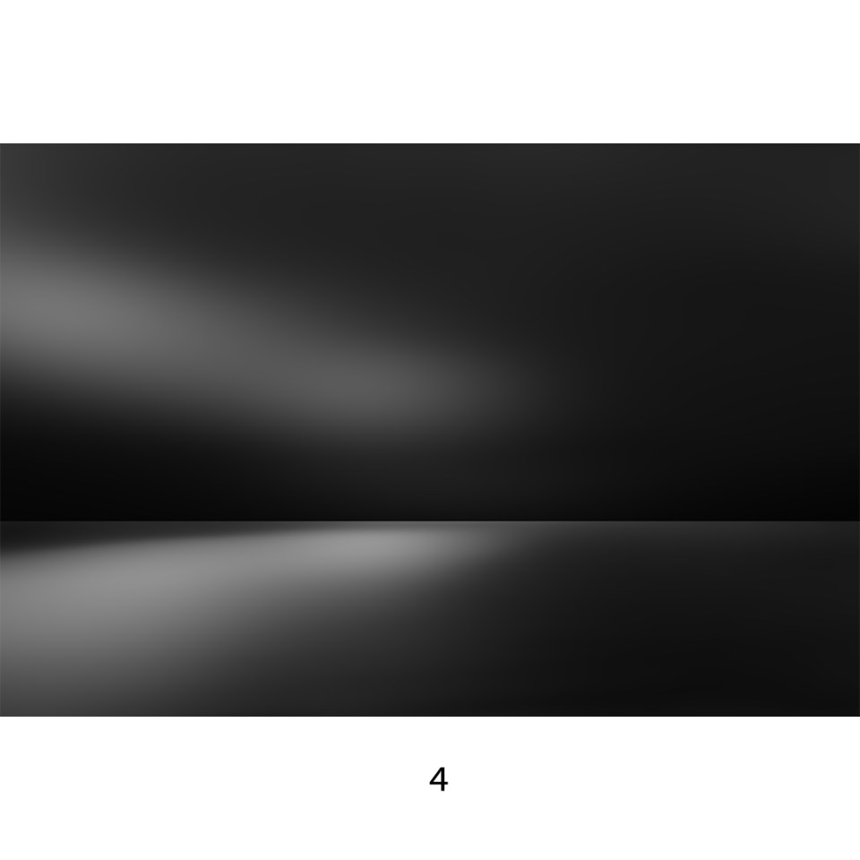
Which image has the most immediate impact? Why?
Which image lasts the longest for you — i.e. which would you want to live with? Why?


Thanks very much.
I’ll be back to regular blogdom as soon as I can. Meanwhile, stay well.
(Nikon D850, Tamron SP 24-70 f/2.8 Di VC USD G2. RAW processing and initial editing in DxO PhotoLab 4.0; Final editing in Adobe Photoshop.)

firstly 3…just going with my gut. Wonderful b/w nice to see your works…smiles and joy your way Michael ~ hedy ☺️
LikeLiked by 1 person
Thank you very much, Hedy. 🙏😊
LikeLike
Beautiful, but beautiful photography
LikeLiked by 1 person
Thank you very much. Do you have a favorite?
LikeLike
1 🙂 – beautiful balance of all the shades 🙂
LikeLiked by 1 person
Thanks very much for stopping by and for replying.😊
LikeLike
4 is the one that caught my attention first [mind you, it’s not really objective because it’s the last one – best way to see these would be in a row on the same screen. Now I have to scroll down, so last tends to be a winner.] However, I would pick 3 for the exact opposite reason. I like 4 for it’s dramatic abstraction but I like 3 more because of it’s subtle continuity and softness. Hope that helps.
LikeLiked by 1 person
Thank you. This helps a lot. I do want to get first impression and then lasting image. You gave me both.
LikeLiked by 1 person
I’m curious as to your own preferences!
LikeLiked by 1 person
I will post a refined version of my favorite. Stay tuned.
LikeLiked by 1 person
…I was going to say, after the ‘survey’. I look forward to it!
LikeLiked by 1 person
😉
LikeLike
I was immediately more drawn to image 4, because my eye appreciates very dark images.
But after looking at all of them a few more times, I think that image 2 holds my attention more. The brighter bright part in the lower part of the image draws me in, and keeps me there.
LikeLiked by 1 person
Thank you very, very much. You are validating my theory that the first impression and the lasting impression are not necessarily the same image.
LikeLike
I almost never get to validate theories – this is an exciting day!!
LikeLiked by 1 person
Glad I could help.
LikeLike
4 – because it invites more discovery.
LikeLiked by 1 person
Thanks very much, Liz.
LikeLiked by 1 person
#2 for both questions. I like the darker sky and brighter cloud, darker sea and brighter reflection (is that a reflection?).
LikeLiked by 1 person
Thank you very much for your response and especially for your reasoning. Much appreciated.
LikeLike
They all look good to me. That said, 3 and 4 together would make a dramatic lighter/darker pair.
LikeLiked by 1 person
Thanks very much. Maybe a diptych.
LikeLike
#3 appeals to me most, because of the brightness. The others seem heavy: the last, almost oppressive. To be perfectly honest, I wouldn’t *want* to live with any of them, but if forced to do so, #3 would be my choice. (You know how I am about monochrome!)
LikeLiked by 1 person
Thank you very much. Think of monochrome is an extremely compressed collar range. 😉
LikeLike
Which image has the most immediate impact? Why?
#1 has the most impact, though #2 is a close second.
Which image lasts the longest for you — i.e. which would you want to live with? Why?
#2. I like it the most and would be willing to keep looking at it any time.
LikeLiked by 1 person
Thanks very much. This is fascinating.
LikeLike
Hi Michael, this is an intriguing exercise. i’ll take door number three, the shining path over the horizon, also intriguing. While following that same path in #4 is a bit darksome and looks more terminal. you’ll probably get a different reaction from people in the northern snow belt, then from people used to warm sand dunes along the Pacific! 🧐
LikeLiked by 1 person
Thank you very much, Robert. What I am discovering in surveying here and on Instagram is that there is absolutely no consensus. It’s about even for all four.
LikeLike
Interesting! Better have the ballots scrutinized for Sharpie marks, etc. But perhaps these are heading for a quadriptych. (There’s my new word for the day! 🧐)
LikeLiked by 1 person
Could be. I’m going to have to have my people recount the ballots under close scrutiny lest they get shot. Quadriptych! I like it.
LikeLiked by 1 person
Ok. So after some reflection, I find that #1 is not one I would want to live with, nor one that makes the biggest immediate impact. In analyzing why, I believe it’s because it has less contrast (perhaps a better way to state that is to say it has a more condensed range of grayscale?) than the other versions of the image.
4 Has the biggest immediate impact, but it’s not an image that I would necessarily want to live with as it’s so dark. It’s very decor-dependent, which I tend not to like to use as a criteria for enjoying a piece of art).
Number 3 is the one I would probably want to revisit and be around the most, with #2 being completely enjoyable and one which I could imagine “having in the space.” I find there’s a greater range of interpretation for me with these two. (Do you see the inside fold of a book when you look at these?)
I’d be interested to hear how others reacted. Happy learning/exploring!
LikeLiked by 1 person
What a wonderful thoughtful reply. Thank you x 1000.
LikeLike
Good stuff! >>> for me, number 4 on both counts, by some margin. 🙂
LikeLiked by 1 person
Thanks very much!
LikeLiked by 1 person
It’s good to hear you are so deeply involved, Michael. Of these three I prefer the last photo, for what it’s worth. Be well!
LikeLike
Oops, I meant the third photo. 🙂
LikeLiked by 1 person
Thanks very much, Lynn.
LikeLiked by 1 person
#3. Very attractive tone/contrast/lighting. And I find this one has more for my minds eye to contemplate, being that, a draw to the Horizon and back out at the above reflection. Great to look at and ponder.
LikeLiked by 1 person
Thank you very, very much for your feedback and analysis.
LikeLike
It’s not just the first impression that has me preferring number 1. I like the rolling metallic feel to the lower part of the image and find that the transition between the two “halves” is softer and more appealing.
LikeLiked by 1 person
Thanks very much. I will now say that Number One is my personal favorite. You heard it first.
LikeLiked by 1 person
Michael, my eyes like 1…
LikeLiked by 1 person
Thank you. So do mine. Definitive result coming soon…
LikeLike
This new creative avenue reminds me of Julia Anna Gospodarou’s architecture work.
LikeLiked by 1 person
That’s a very nice compliment, Brenda. I very much admire her work.
LikeLike
Immediate impact was an easy one for me – #4. I’m immediately, almost impulsively, drawn to darker images and images with contrast.
That attraction often compels me to add too much contrast in my own images so that when I revisit them I decide that I went over the top and go back to the editor and soften the image. This is probably why I came to the conclusion that the image I can live with is #3.
I asked my wife. She was originally struck by #2 but could live with # 3
San Gregorio is an old haunt that goes all the way back to childhood. I’d be interested to see the original images.
Here is a postscript to my comment about the originals. I was just about to post my comment when my wife came in and I asked her to look at the images. Sitting at my computer I really couldn’t visualize the scene. As she was looking at the images I stood a couple of feet behind her and I was suddenly struck by what the originals might have looked like. You took these on a foggy/cloudy day in late afternoon?
Since a trip to Morro Bay in October I’ve been visiting the coast quite often but not so far south. I’ve been spending most of my time at Gray Whale Cove and the beaches at Pacifica, particularly Rockaway.
Stay safe Michael.
LikeLiked by 1 person
Thanks very much for the really useful feedback. I’ve settled on number 1, interestingly — but I may try a blend of 1 and 4. When I do, I’ll also post the original. It was a gray late afternoon and the original uses slight ICM. Shot from the high bluff just south of the beach Ah, yes. San Gregorio goes back to High School, along with that entire stretch of coast going down to Gazos Creek. Doing things that we shouldn’t have been doing. I’ve been scouting for places that have impressive surf and accessible vantage points. Ideas?
LikeLike
San Pedro Beach/Pacifica State Beach. I guess they’re one and the same. The entrance to the parking is at the south end of Pacifica just before the drive up the hill towards the tunnel. You have to pay for parking.
The south end of the beach is full of surfers. The north end, has only a few surfers and a bigger break.
Gray Whale Cove. A flight of stairs to get to the beach. Big breakers and on both ends spectacular crashing waves against cliffs. Be aware that the north end is a nekkid beach but this time of year only diehards if anyone at all.
A week ago Ocean Beach looked like the Banzai Pipeline.
Stay safe
LikeLiked by 1 person
Thanks VERY much. Nekked don’t bother me. I used to be a habitué back in the ’70s. If I did that now, people would vacate the beach in horror.
LikeLike
The only reason I mentioned it was because cameras at nude beaches aren’t often a good mix.
LikeLiked by 1 person
Excellent point. Especially one with the long telephoto lens.
LikeLiked by 1 person