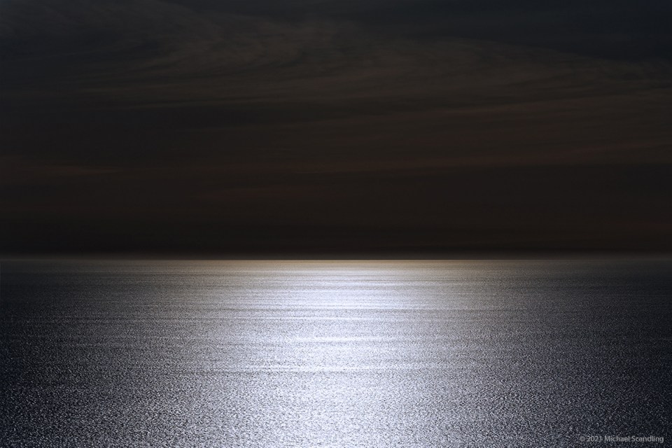
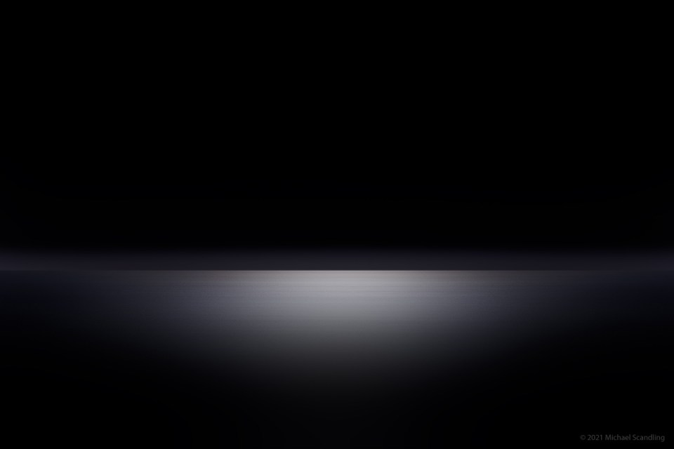
April 10, 2015, Hurricane Point, Big Sur Coast. August 8, 2017, my office. Morning of May 13, 2021, my office. Evening of May 13, 2021, my office.
On January 12, 2019, I wrote in my twelfth blog post: My dog and I decided that conditions were right for a ride down the coast. Travels with Chewy. And Nikon.
We made it as far south as Hurricane Point. Crystal clear. The horizon went halfway to Hawaii. And so went the sunbeam. Chewy and I looked out to sea. He turned and looked to me as if to say, “this is special.” A sea dog. A wise one.
Aided by a neutral density filter, I exposed to preserve the highlights. Back home, post-processing brought out the wispy clouds. I cropped in homage to Rothko.
Last week I woke up at 4 a.m. thinking about photography. I do that. Still working on distilling the essence of a scene. This particular picture was on my mind. It’s always been a favorite and it’s still a favorite in its original form. But for me the major appeal is the horizon itself. I got up in the morning to see how far I could pare it down.
I posted it on Instagram and it got a so-so response.*
I took another look later the same day and decided that the clouds, which are so evocative in the original, simply muddy up the simplified version in their vestigial form. I loved those clouds. In the original version. But not here. The picture needed refinement. An old editing truism: Sometimes you have to kill your darlings.
Killing the sky meant that suddenly there was too much foreground, so a lot of that went away as well. But some of the fog bank stayed. Maintaining a balance was quite an exercise, but I finally arrived at the magic moment where I almost involuntarily sit back and stare. That’s the time to stop.
I posted it on Instagram a couple of days later and immediately got a much better response.
(Nikon D750, Nikon 28-300mm f/3.5-5.6G ED VR. RAW processing in DxO Pro. Editing in Photoshop.)
*I generally have a low opinion of social media. That definitely includes FaceBook and for the most part Instagram. Despite that, in my case I consider Instagram a necessity for exposure. I only follow photographers whose work I admire and respect, and for the most part my followers are photographers who admire and respect my work. I stay strictly away from politics and snark. I don’t alter my work to get likes, but the feedback does tell me how well I’m communicating and that gives me something to reflect on, absorb, or leave alone.


A wise doggy indeed. Strangely, eventhough the last one appeals to me, it’s the first one that draws me in more.
LikeLiked by 2 people
Thank you very much, Marina. I think that’s very interesting.
LikeLike
My “problem” is that I like all three.
LikeLiked by 1 person
Oh so fine … yes I’m also liking them all 🤓👌
LikeLiked by 1 person
Thank you. If you had to choose one?
LikeLiked by 1 person
The first one…feels like more shimmer 🤓
LikeLiked by 1 person
Thanks Hedy. 😊
LikeLike
An interesting post for me to read as I enjoy looking at the different options and thinking about the differences but in the end I guess this particular form or style is just not my thing! But thank you for posting.
LikeLiked by 1 person
Thanks very much, Liz. I knew going in that isn’t for everybody. Just so long as it’s for SOMEbody! 😉
LikeLiked by 1 person
I’ve tried to find words for my response since you posted these. Finally, I decided on this: I’m willing to peer into the second and third, but I feel the urge to walk into the first.
LikeLiked by 1 person
We’ll put. Thank you. I’ve always been one to look AT the horizon. But yes, that water is walkable.
LikeLike
It’s a great feeling when you know that a picture is finished. I looked at them yesterday and I preferred the first one, this morning I like the middle one better. 😉 they are all very nice but the first one is a very different visual experience from the last two.
LikeLiked by 1 person
Thank you very much. This evolution was an experiment. Personally I like both extremes — the first and last — for different reasons. Neither is what appeared in nature. Both are interpretations. The first is like a conductor’s interpretation of a score. The last two are deconstructed like jazz. Preference depends on individual mood and taste. If you like classical and jazz you can enjoy both at different times. Maybe I should do a rock version. No… I think not. 😉
LikeLiked by 1 person
If I saw any of these alone with no reference I’d have a positive reaction to two and three and an ambivalent one to the first. There is something about the color at the horizon that I don’t find appealing but I do like the texture. The second and third are more peaceful and inviting with the third offering the more quiet contemplation..
LikeLiked by 1 person
WordPress sometimes has its way with colors and it certainly had its way with a color on the horizon on the first one. I did not make it that way. Interestingly enough, another person sent me an email saying they liked it. The second and third one, the third one especially were intended to give an invitation to quiet contemplation, and I’m glad you took it that way because that’s how I meant it. Thank you very much.
LikeLiked by 1 person
Yup. I’ve learned to not let what WP does to color bother me. A while ago I would re-edit until it looked right but after a few times decided to let things go. Not everyone is calibrating their displays anyway. We all see color differently, I just watched a David Ward “On Landscape” YT video about just that, so I am not surprised someone else saw the color as pleasing.
LikeLiked by 1 person
I like how you processed the surface of the sea here.
In the first picture I first thought it was some kind of road and in the later two it first looked like some metal objects…
…so interesting how you take your minimalist style to levels where you can see different things in the pictures.
LikeLiked by 1 person
Thank you very much. The delicate balance is between being too minimal and not minimal enough. It’s balancing on the head of a microscopic pin.
LikeLike